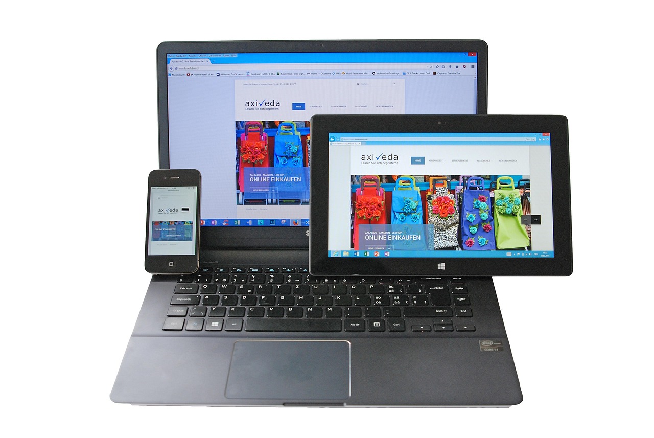
The Mobile-First Imperative: Why Your Website’s Responsive Design Can’t Wait

The Mobile-First Imperative: Why Your Website’s Responsive Design Can’t Wait
In today’s interconnected world, your potential customers aren’t just sitting at their desks anymore. They’re on the go, scrolling through feeds on their smartphones, checking emails on tablets, and making purchasing decisions from anywhere. If your website isn’t delivering a seamless, optimal experience on every device, you’re not just missing out on traffic; you’re actively pushing customers away.
The concept of responsive design has been around for years, but the shift to a mobile-first imperative means it’s no longer a nice-to-have – it’s a fundamental requirement for online success in 2025. At Jaytech, we build websites that aren’t just mobile-friendly, but are designed from the ground up to excel on smaller screens, ensuring your business captures every opportunity.
Beyond “Mobile-Friendly”: Understanding Mobile-First
For years, “mobile-friendly” meant adapting a desktop website to fit smaller screens. Think of it as squishing a large image into a small frame. While it worked, it often resulted in compromised user experience, slow loading times, and awkward navigation.
Mobile-First Design flips this approach. It means:
- Prioritizing the Smallest Screen: The design and development process begins with the mobile experience. What are the absolute essentials? What’s the core message? How can we make it effortless on a phone?
- Adding Up for Larger Screens: Once the mobile experience is perfected, features and content are progressively enhanced for tablet, laptop, and desktop views.
- Focus on Core Functionality: By starting small, designers are forced to prioritize, ensuring critical information and actions are immediately accessible without clutter.
This approach results in a website that is inherently more streamlined, faster, and truly user-centric across all devices.
Why Mobile-First Design is Non-Negotiable in 2025
The reasons to embrace a mobile-first approach are manifold, impacting everything from your customer’s perception to your search engine rankings.
1. Dominance of Mobile Usage
- Traffic Volume: A significant majority of global web traffic now originates from mobile devices. If your site isn’t optimized for these users, you’re alienating your largest audience segment.
- Customer Expectations: Users expect a flawless mobile experience. Slow loading times, difficult navigation, or distorted layouts lead to immediate abandonment and a poor perception of your brand.
2. User Experience (UX) is Paramount
- Ease of Use: Mobile-first ensures tap-friendly buttons, easily readable text, intuitive navigation, and quick access to information, reducing user frustration.
- Higher Engagement: When a site is easy to use on mobile, users are more likely to spend more time, explore more pages, and complete desired actions.
- Brand Reputation: A seamless mobile experience reflects positively on your brand, indicating professionalism and attention to customer needs.
3. Google’s Mobile-First Indexing
- SEO Impact: Since 2018, Google has primarily used the mobile version of a website’s content for indexing and ranking. This means if your mobile site is subpar, your entire search ranking could suffer, even for desktop searches.
- Crawl Budget: Google’s crawlers assess your site’s mobile version. A poorly optimized mobile site can lead to inefficient crawling, potentially impacting how much of your content gets indexed.
- Core Web Vitals: Key Google ranking factors like loading speed, interactivity, and visual stability are heavily influenced by mobile performance.
4. Conversion Rates and Revenue
- Reduced Friction: A smooth mobile journey eliminates obstacles that could prevent a user from making a purchase, filling out a form, or contacting your business.
- Increased Sales: For e-commerce businesses, a mobile-optimized shopping experience directly translates to higher conversion rates and increased revenue.
Key Elements of a Responsive, Mobile-First Website
To ensure your website is ready for the mobile-first world, focus on these critical components:
- Fluid Layouts: Designs that automatically adjust to screen size, preventing content from being cut off or requiring horizontal scrolling.
- Flexible Images & Media: Images and videos that scale appropriately, maintaining clarity and loading efficiently on smaller screens.
- Touch-Friendly Navigation: Large, easily tappable buttons and menus, often collapsed into a “hamburger” icon for mobile.
- Optimized Performance: Fast loading times are non-negotiable on mobile. This means optimized images, minimized code, and efficient server responses.
- Legible Typography: Font sizes that are readable on small screens without requiring zooming.
- Concise Content: Prioritizing essential information for mobile users, making it easy to scan and digest on the go.
Don’t Let Your Website Lag Behind
Ignoring the mobile-first imperative is akin to closing your doors to a significant portion of your potential market. It leads to higher bounce rates, lower search rankings, missed conversion opportunities, and ultimately, stifled business growth.
At Jaytech, we don’t just build websites; we craft digital experiences engineered for today’s multi-device world. Our Mobile-Friendly Web Design and Development services ensure your website is not only visually stunning but also technically robust, delivering exceptional performance and user satisfaction across all devices. We build your digital future, starting with mobile.
Request Your Free Web Design & Development Consultation Today
Explore our web design expertise: https://jaytech.live/mobile-friendly-web-design-and-development/
Get a tailored quote: https://jaytech.live/get-quote/
Contact us directly:
- Phone: +1 (463) 256-3979
- Email: info@jaytech.live
- Website: https://jaytech.live
